
Introduction
As someone who enjoys being creative and having every aspect of my creations done the way I visualize them in my head, I find designing my own book covers a therapeutic alternative when working on a new project.
I want to share with you my process and hopefully inspire someone who wants to design their own covers!
From Concept to Creation
Designing covers requires research, dedication, and most of all: creativity. I begin my concepts of a cover while I’m writing. Giving me the opportunity to capture the concept and feelings I am trying to portray in both the story and the cover.
Research is a great starting point when designing your own story cover. First, the genre and subgenre of your story need to be decided. If you’re already writing, it’s likely these things have already been decided.
Once you have this decided, go ahead and study the trends of those genres. This is quite easy, you can look at the trending books of the genre for that year or the prior year and pretty easily figure out what styles are trending. (This isn’t your green light to dupe your favorite cover of the same genre, you’re only studying trends, not copying them!)
After studying trends, you should be able to decide what elements from those trends you’d like to incorporate into the style of your own cover (illustration, bold, dark or muted colors, photography, etc.). Now, it’s time to consider how you want those elements depicted on your cover. (It’s important to remember that you should choose the elements that represent your story!)
As a visual aid, I will break down the cover for Love Bytes.
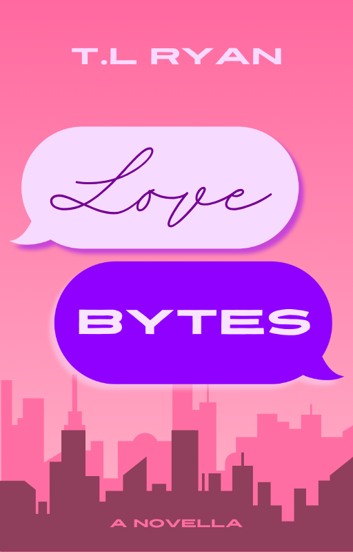
First, we’ll start with the background, and why I chose the colors, ombre, and graphics.
You’ll notice that the background is ombre of a hot pink at the top, to a light pink toward the bottom with city buildings in two different pinks at the bottom of the page, giving the illusion of buildings that are both in the foreground and background.
What do these elements represent and why did I choose them? The pinks (and purples) were chosen to represent the futuristic setting of the story, reminding one of the “cyberpunk”-esque world. The ombre give the cover a “setting sun” feel, representing the time in which a lot of the story takes place—in the evening. And the city buildings represent the setting in which the story takes place.
Next, we’ll look at the title.
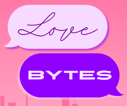
You’ll notice that the title Love Bytes is depicted “text message” bubbles. This was a choice that I made, representing the idea that a majority of the conversations that are held between the main characters in the beginning of the story, are held over chat.
The decision to make these purple, were to both contrast the pink background, and, as mentioned before, representative of the futuristic sub-setting of the story.
You’ll also notice that the these is a subtle shadow behind the chat bubbles against the background, This choice was made to make the title “pop” more, instead of it being flat against he background.
The typography of the title was also a deliberate choice, and not one only made because it “looked good.” It’s important to make certain choices when it comes to designing the title for your book.
The saying “don’t judge a book by it’s cover” is utter nonsense in the literal form. Because people do, in fact, judge your book by it’s cover. And it’s helpful for them to be able to have the ability to discern some things just by looking at the cover.
The cursive font for “love” was chosen because it 1) stands out against the other font that was used, and 2) represents to the would-be reader that the story is a romantic one.
The other font used for the rest of the cover, is used to represent the fact that the second main character in the story is an android/chat bot. The font itself looks cyber-esque, giving light to this tidbit.
As for the rest of the cover (author name and book type) are placed in their positions with the reader’s gaze in mind.
First, the reader’s gaze is drawn to the title, as it’s the most stand-out part of the cover. Next, the reader’s eyes are drawn to the bottom part of the cover, where the book type and graphics are. Lastly, the reader’s eyes are drawn to the top of the cover, where the author’s name is.
The size differences among all of these elements are deliberate choices one must make. Some authors (if their name has enough draw) make their name the largest/most eye-catching part of the cover. In my case, however, I want the title design to stand out among the rest, my name not nearly as important as the other aspects.
Even if my name is the second largest in font-size, that does not necessarily mean that the reader’s eye will be drawn to it second. The graphics at the bottom of the cover are more interesting, bringing the eye to the bottom of the page where “novella” is. My name only being noticed because it’s in an obvious font, color and size in the middle of the top of the page.
All of these elements that I’ve implemented into the design of the cover, are intentional choices I’ve made, all with their own rationale. These are the things that you should consider when designing a cover for your story.
Tools
For someone just starting out, the best place I’ve found for design is Canva. They offer millions of free designing elements, fonts, stock photos, etc. All for free!
Canva is the best place to start. Especially for those who aren’t too savvy when it comes to drawing or Photoshop.
But if you are fortunate that you can draw (digitally), I tend to use Infinite Painter, as I have an Android tablet, but I’ve also used Procreate in the past.
I still use Canva for things that I’m unable to accomplish on Infinite Painter, and it makes designing so much easier.
Conclusion
Designing book covers isn’t for everyone. It requires a lot of outside-the-box thinking, design knowledge, research and hardwork. But if you’re determined enough, and do plenty of research (outside of this article), it can really help your visions come to life. Especially if you have a difficult time articulating what exactly it is that you want to an artist.
This is not an “anti-cover artist” article, and I am 1000% for hiring artists for things you can’t accomplish on your own. But it’s also possible to learn some of these things. Everyone has to start somewhere. And if you’re someone who is actually determined to learn these things properly, and not just because you don’t want to hire someone, design is a great option for you!
